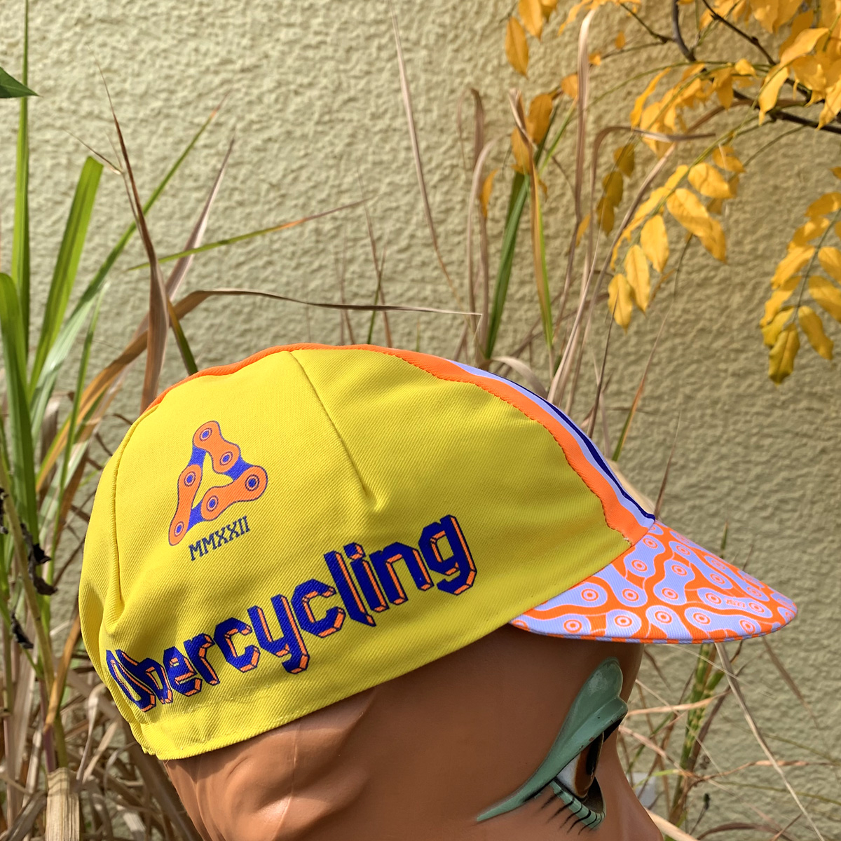
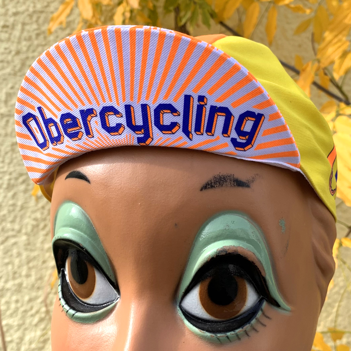
”Obercycling” is an non existent cycling club that might be located in Munich but could also be anywhere else in the world. The name is made up in reference to some of the Munich city districts like ”Obersendling” or ”Obergiesing”
The German “Ober” does not only have the meaning of ”upper” but can also be ”more than”, ”the best”, ”top”
… so ”nothing beats cycling” or ”top cycling” could also be the motto of this cap.
The triangle chain link logo comes from remains of shortening chains for my bikes. Often it‘s three double link leftovers that can nicely be shaped this way. Club ”founded” in 2022 so this number is displayed in Latin below the logo.
On the other side of the cap you can find a different emblem of the club. O and C combined to one shape , a size 10 mm wrench for working on brakes and the like sticking out on top and a 15mm box wrench for single speed hub nuts extending to the bottom. Size is more or less 1:1 to real life tools.
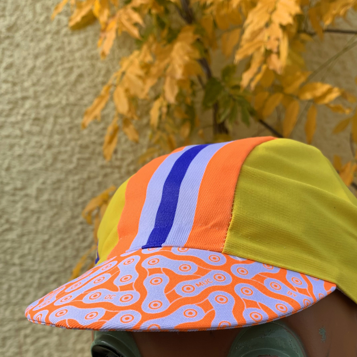
The font used for the type on this cap is made by myself some years ago – Longhorn comes in different styles of which here the 3D and 3D fill ones are used. This kind of font, the colors, the rays on the bottom of the brim – they are supposed to scream ”80‘s, ice cream, beach and fun“ … and cycling of course.
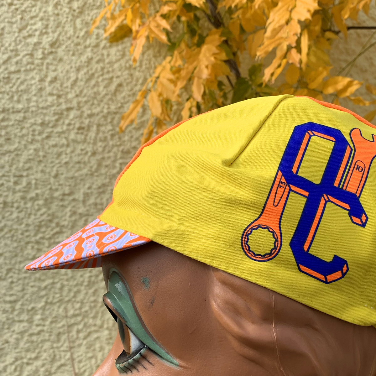
Because neon orange ink is not printable on yellow fabric, the yellow color also had to be printed on white. I think it was not easy to make the three colors fit without some white showing at the edges but Apis did a great job with printing.
The cap is made of 65% polyester and 35% cotton. Silk screen printed and sewn by Apis in Italy.

Zombie Hunter cycling cap - belldorado
23. November 2024[…] design elements are taken from the style guide that I have developed for the campaign.Just like the Obercycling cap this one uses three printing colors on white fabric but also sports the antibacterial tape […]